|
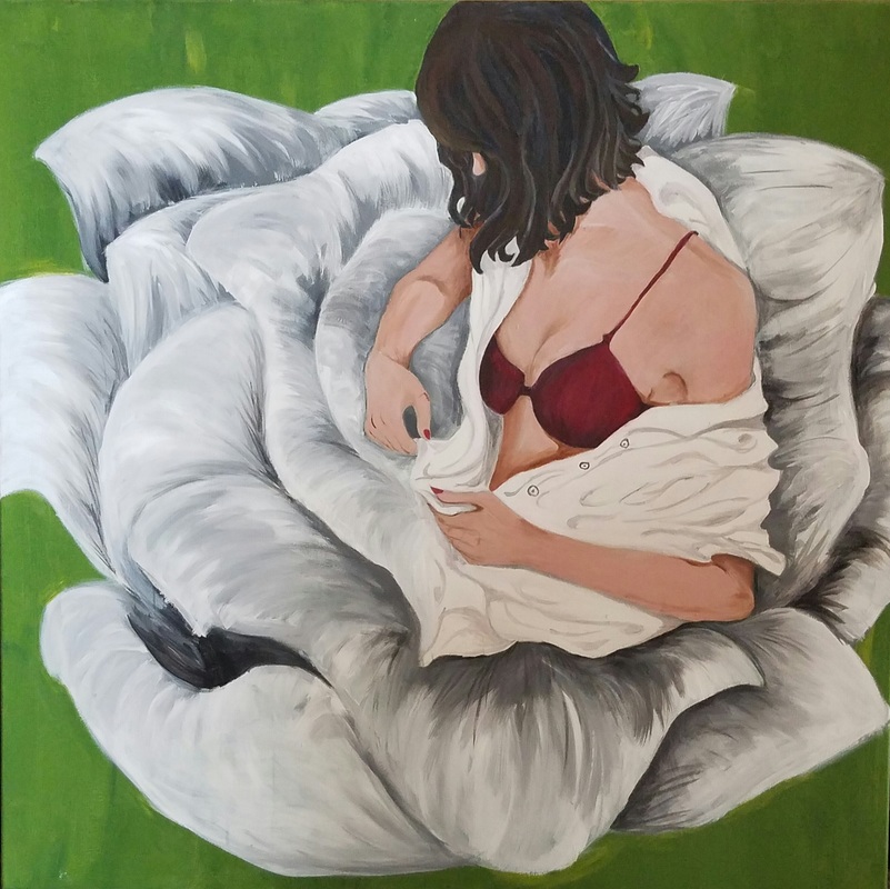
I created this portrait, not as a self-portrait, but merely a portrait of my feelings, and how they relate to me undressing my thoughts and feelings towards my life. I created this portrait using oil and acrylic paint layer on top of a layer, to allow myself the option of different mediums and the experience. I also drew the undressing female based on another artist drawing, the same exact appearance.
|
Meaning of the Piece
Before creating this painting, I had thoughts about me being overwhelmed and not knowing what to do with life. I was met with so many expectations and the reality that I wasn't able to stomach it all. From the idea of going off to college, to applying to so many scholarships, to multitasking with homework and my studies, to meeting the teachers expectations and worrying about my grades dropping, I was already very depressed at the beginning of my senior year. I decided to create this portrait in order to throw my feelings across and communicate the idea that people can have a point of breaking. The painting's look does not depict the idea of breaking apart, however, it convinces the idea of starting new, that's all that really matters.
I created my painting to portray me, or more like my feelings in physical form, undressing all these responsibilities and all these ideas that have been thrown at me, and just starting anew and setting everything else aside. Although, I may not be able to do that because senior year is very crucial to the beginning of my professional education, I have to put my all in order to convince these colleges and universities that I have what it takes and the motivation to be something, to create something that'll make my parents proud, me, my teachers, and all the people that care for me and want to see me succeed.
This painting relates to all the people out there that are stressed, depressed, don't have anyone they can relate to or be their motivation and inspiration. This relates to the world as a whole of nurture and care and beginning something and giving life to something that'll change many aspects and conventions that are placed upon so many unwilling people. No matter what you are met with, you can disregard and start anew, you still have the chance to meet expectations, but in your own way. You do not have to follow the crowd, be yourself and you shall go far.
Connection to the ACT
1. Identifying the cause-effect relationships between my art work and the inspiration is fairly simple, I utilized the style of art Nouveau using the flowers of bloom, while also using the theme of nudity, or merely the bareness of feelings and responsibilities. I, however, did not adopt much of the definition of the artist's art work, which is based on advertisement and global issues.
2. The two artist inspiration, Patrick and art Nouveau's perspective deal with global issues such as, sexism and racism, which takes the male role as a heavy burden while instilling all responsibilities towards the female that has to handle what men usually have to on a daily basis. Art Nouveau attends to the utilization of women to advertise the products of the producers to the consumers.
3. While I was researching my topic of inspiration, I learned that each artist utilized different mediums and methods to deliver their message. The conclusions I've made is that you cannot begin creating your own form of art until you've experience everything art has to bear. That it's adequate to utilize the appearance of other art form, it is not considered copying, merely an inspiration that you'll end up manipulating.
4. The central idea and theme around my inspiration is the regard of being bare. Not necessarily in a physical bareness, just the central heart of your feelings and emotions. My inspiration came from the beginning of my senior year of high school .It was depressing, stressing, and pure sad. I bared the feelings of wanting to give up, however, I couldn't bare to and there was no one to convey my emotions to, thus converting it into an artwork.
5. The conclusions I've made after researching my topic was that it was a better idea to convert my emotions into a painting rather than any other mediums because that's what truly conveys the most to the viewers. Also, the fact that Patrick Earl Hammie decided to handle paint rather than anything else to truly send the message across to allow the viewers full contemplation.
Artist Inspiration
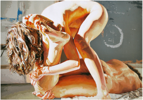 “Night Watch” Significant other series. Patrick Earl Hammie,
172.7 x 243.8 cm. Contemporary movement, oil on linen, 2011.
“Night Watch” Significant other series. Patrick Earl Hammie,
172.7 x 243.8 cm. Contemporary movement, oil on linen, 2011.
For my art inspiration, I decided to utilize Patrick Earl Hammie's way of painting in the nude, or as I like to view it, nude feelings. To me, it doesn't look like an inappropriate picture that many might look at and disagree or have a distaste towards, I merely see it as naked feelings. The world problems he likes to convey through his art are merely the emotions and feelings that is embedded deep within the issue. It's a measure of how far one can view the value and contrast of these measures, and how much the artist had gone through in order to focus his whole art career into conveying the problems the world refuses to acknowledge.
Patrick utilities the style of culture and diversity problems throughout the world.
While also going in depth with the depth and perception of light versus dark and the contrast of skin tones touching and greeting the intimate feeling of lover maturity and responsibility.
Patrick utilities the style of culture and diversity problems throughout the world.
While also going in depth with the depth and perception of light versus dark and the contrast of skin tones touching and greeting the intimate feeling of lover maturity and responsibility.
|
I also incorporate the idea of advertisement using women and flowers as the main attraction to the painting. Art attracts many people who find it usually appealing, but many also pay attention to the deeper meaning it may contain in contrast to it's outer beauty, basically the visuals.
Nouveau Art and nude art contributes to send the message of rebirth and incorporate the idea of advertising that the painter is portraying their feelings of either giving up or starting all over from scratch. In this case, it's the latter option. I used these two artist as an inspiration to not only my painting of feelings, but as an influence to my day to day lifestyle. As an example, Alphonse Mucha paints a picture of Sarah Bernhardt, whom I honestly do not know, however, his usage of white lilies, senses the theme of pureness and the aspect of being a woman. |
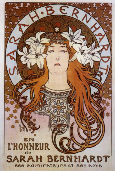
"En l'honneur de Sarah Bernhardt - ses admirateurs et ses amis", lithograph in colors, 1896, on wove paper, Alphonse Mucha.
|
Process
|
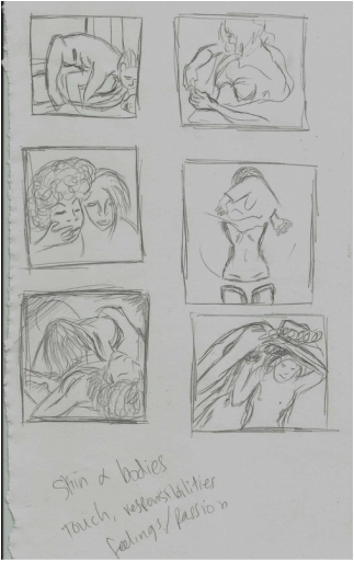
Step 1- Begin creating your process sketches. A tip to keep in mind, research what you really want. if you merely draw pictures and look up what they might mean, you'll only have a tougher time deciding and in the long run, you'll end up wanting to keep adding things that'll crowd your artwork. Have your inspiration figured out from the very beginning, that I guarantee will save you time. Have at least 5 process sketches to begin your process of ideas and the forming of these images.
|
Step 2- After figuring out your sketches and your inspiration, create a canvas that would fit the frame of your inspired idea/sketch. After doing so, gesso the canvas in order to give it a base coat that would not let paint bleed through. Also. gesso the rear edge parts in order to prevent the canvas from shedding threads and the like that might get in the way of your painting.
I had so much trouble drawing her hidden right sided arm. I was trying to proportion the width of her arms in comparison to her body, head, and hands. I had to erase it and draw it all over and keep doing that for at least thirty minutes until I was able to get a good drawing that made sense to my eyes and how it viewed the proportions of the body.
|
|
Step 3 - After gessoing the canvas, you can either draw, as step 2 says, or you can paint the base coat after the gesso dries. Either ways, you'll end up drawing the back ground, however, the latter option is much easier and efficient, saves a lot of time. As you can tell, my base coat that I decided to manipulate was a greenish color, which I was able to develop by mixing in blue and yellow. I left hints of yellow and blue on the canvas, because I wanted my painting to have a factor of irregularity, many colors mixing in and shaping the background, giving it more than one shade, and helps materialize the brush strokes which give life to the background.
|
Experimentations Since I wanted to have variety within my background, I decided to create the green color that I wanted, then went through and added more yellow, as a result, when I paint the background, some areas would have a deeper shade than the other, and since green is a bit of a cold color and yellow is warm, it contrasts with one another, which intrigues the painting and give it a sense of diversity and cooperation. (As you can notice, some shades are lighter than others, while some are darker).
|
|
Step 4 - Begin outlining/painting the parts of the body or the starting object of your painting, that way you can paint everything else based off of it. I had so much fun working on the detail of the hair, and also painting it in general. I just love painting so much. But some aspects of the image looks unrealistic, thus I try to humanize it as much as possible.
|
Step 5 - Finally, you end up creating your painting, not that you haven't been doing that from the very beginning. I shaded in some parts, then decided it did not look realistic then I went back and applied water over it to give it the fuzzy appearance. I thought I was okay in shading it, it kind of looks like I was overdoing it in my perspective, however, I am proud of some of the shadings, such as the nose area, I don't like the WAY I shaded it, rather, the COLOR I used. It appeared very realistic to me, I will use that color as a reference when I paint skin the next time. Also, the skin color was the best skin color I was able to conceive since beginning art.
While we're talking about shades, I believe the shading of the shirt was average, it didn't turn out that great. It looks like an exaggerated version of a squiggly line. The shaded color did not match the real world color. I used gray, however, I feel that I should've used black mostly because it's a bigger contrast, and usually shading is a large value of color than the actual color, and gray seemed to be a slightly deeper color, like a design. Next time I need to fix that. As for color of the lingerie, I thought it looked decent, I didn't have many problems with it, besides trying to make it emerge into one direction to give the emphasis of the circular shape. I believe I could have done it better, but the attribute of time kept nagging on my priorities to be satisfied with what I made. |
As for the skin, as I've said, I loved the flustered pink color of the skin, however, I can't say that about the shading. I tried my best to reproduce the shading technique of Patrick Earl Hammie, however, I don't quite believe I was successful. I dislike the way the shading appears. Some areas are too dark while other areas appear too light, which contradicts itself.
Lastly, the flower that I decided, along with my teachers helpful ideas, to create in the background, or more as something she's emerging from, the innocent flower she is. Then I also decided to portray the flower merging into a shirt that surrounds her delicate frame. I dislike the flower very much. I feel that it seems very out of place in the canvas in the rear of the girl. I also thought the shading criteria was extremely off point. It did not portray what I wanted to portray. I first started creating the lines and petal frames of the flower, then began painting it all white, and then went in with dark and light gray. I was too tired and lazy to fix it and make it look presentable. But knowing me, I was too lazy for life. But I really wanted to make it look even more beautiful than it should look, it came no where near my expectations, I'm a little disappointing with myself. I'd like to fix this the nest time I create a painting, which is very soon.
Lastly, the flower that I decided, along with my teachers helpful ideas, to create in the background, or more as something she's emerging from, the innocent flower she is. Then I also decided to portray the flower merging into a shirt that surrounds her delicate frame. I dislike the flower very much. I feel that it seems very out of place in the canvas in the rear of the girl. I also thought the shading criteria was extremely off point. It did not portray what I wanted to portray. I first started creating the lines and petal frames of the flower, then began painting it all white, and then went in with dark and light gray. I was too tired and lazy to fix it and make it look presentable. But knowing me, I was too lazy for life. But I really wanted to make it look even more beautiful than it should look, it came no where near my expectations, I'm a little disappointing with myself. I'd like to fix this the nest time I create a painting, which is very soon.
Reflection
This was the very first project that I knew exactly what I wanted to create from the very beginning. I had the idea of nudity very clear in my mind, but it was not in the perspective of wanting to show off skin, rather, to undress the responsibilities that have been heavily heaved upon us as senior high school students. It may sound less drastic than it looks, however, that is the main goal for this portrait. The idea of compressing many thoughts and meaning into it that becomes a simple look yet a meaning so deep it becomes overwhelming for the viewers.
I decided to use an acrylic green colored background to give emphasis to the flower and relate it to nature as much as possible, because nature symbolizes rebirth and that is one of the main themes that is depicted within the painting. As for the flower, I decided to shade the depth side as a dark/light gray to represent shading, I may not have been able to do a well rounded job since I was going through a depressing mood and decided not to go over and touch up at all. I left it the way it was, and now that I am looking back at it, it made me realize how much of a mistake that was. If I had fixed the edges and shaded it correctly, giving it the perception intended, it would have been a very good piece that I might've been proud of. Otherwise, I dislike this piece just like any other piece I've made. I continue finding faults within my artwork that drives me insane and arouses my inner thoughts of recreating everything all over again. Although, I'm well aware I am not capable of doing such a thing at the moment with everything that I am dealing with.
The very first part of the canvas that I worked on was the female in the middle. Of course I hand drew the picture and went in with the paint. I began painting her hair, the first thing I did was outline her hair, I created a black undercoat and decided to go in with a black mixed blue color. I had so much trouble trying to illustrate my highlights and color difference in the hair, it was troubling, I don't think I was able to portray the hair as realistic at all, I don't like it much.
I worked on the shirt next, I decided to give it a white coat to match the flower and provide an appearance that the rose petals are beginning to form a shirt around the woman's body. To give her a purpose, or in other words, latching responsibilities onto her. However, it is also a form of rebirth, going from her innocence and beginning to grow and adapt to the environment around her. I tried to match the two colors of the shirt and the rose, but the shirt came out to be a warmer color than the rose, as it turned out a cool white color.
While working on the skin tone, I did not have many problems with it. I liked the skin tone that I created very much, it was the very first skin tone that I created that had such vibrant human color, I fell in love with it, however, for the shading, I believe I could do a better job of it. I used different tones of shades however that only gave it an inconsistent appearance. I was not a fan of the shading in comparison to the skin tone, although I really liked the shade that ran on top of her nose, it truly looked like a shadow created in real life, however everything else was something that yelled, "inconsistency"!
I believe the whole painting has aspects that compliment one another, thus becoming consistent and appearing whole. I do not like my painting, but it's one of the artworks that I've created and I should be proud of it, which I am, can't say all the time though.
As for the meaning of the piece, I believe that when someone looks at it, it doesn't portray the meaning I intended it to portray, mainly because it shows a girl taking off her clothes, which can come across as someone wanting to show skin and be themselves. I don't believe anyone would think that it's my inner heart screaming out wanting to be someone different and defying my fear and concept of all the odds that I've been facing. Sure, it looks like someone is unveiling a weight and taking it off of themselves, however, no one will have the exact thought about what it means.
Based on one of my classmates, they said that what they thought when they first saw it, was that the painting was expressing the beauty that's within the women, or it can be of anyone. Someone that is unveiling their heart to the world.
This basically is close to the meaning that I had, however, it isn't merely about beauty, but of what I have been piling in my heart and all my expressions and thoughts and ideas that I've been repressing and holding back from expressing my inner personality.
